7 Tips For Bespoke Web Design

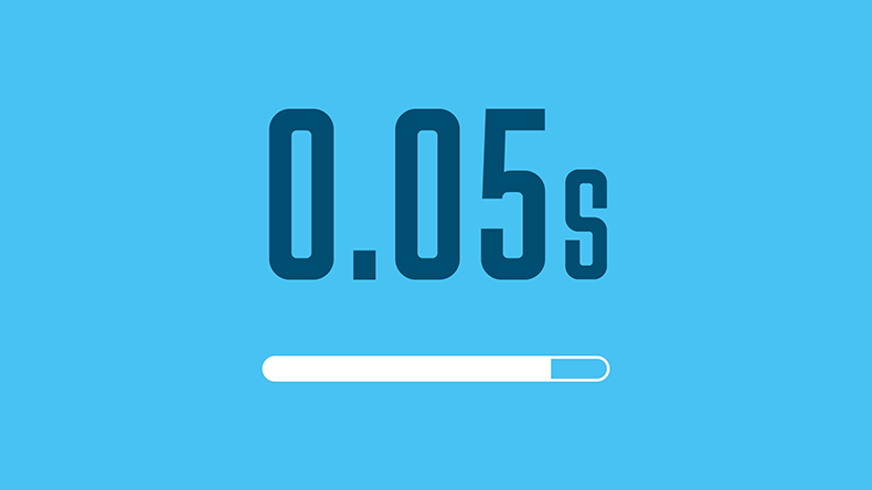
Did you know? Website visitors create an opinion of a website in only 0.05 seconds (Behaviour & Information Technology).
You’re still here! That’s a good sign 😊
Today we’re going to provide you with 7 tips for bespoke web design.
Let’s begin:
Bespoke Web Design Tip #1: Page Speed
Contents:
What is page speed?
It’s a measurement of how fast the content on your page loads.
Why is page speed important?
It’s very important for User Experience (UX).
Think about it:
You visit a page on a website but it takes a while to load (…say 5 seconds). You’ll most likely leave, right?
New research by Google has found that 53% of visits are abandoned if a mobile site takes longer than 3 seconds to load.
What can you do about it?
Introducing Google’s PageSpeed Insights 🥳
PageSpeed Insights (PSI) reports on the performance of a page on both mobile and desktop devices. In the report, it provides suggestions on how that page may be improved focussing on Core Web Vitals.
What are the Core Web Vitals?
Core Web Vitals are 3 metrics that represent a distinct facet of the user experience. They are:
- Largest Contentful Paint (LCP – Loading): measures loading performance. To provide a good user experience, LCP should occur within 5 seconds of when the page first starts loading.
- First Input Delay (FID – Interactivity): measures interactivity. To provide a good user experience, pages should have a FID of 100 milliseconds or less.
- Cumulative Layout Shift (CLS – Visual Stability): measures visual stability. To provide a good user experience, pages should maintain a CLS of 1 or less.
What tools can you use to measure them?
- Lighthouse Chrome extension
- PageSpeed Insights
- Chrome DevTools
- Search Console (Core Web Vitals report)
- Web.dev’s Measure tool
- Web Vitals Chrome extension
- Chrome UX Report API
What do we recommend?
Choose one or two that suit your way of working.
Keep an eye on your website’s page speed. Focus most of your energy on pages that deliver the most organic traffic to your website, incorporating others over time.
Tip #2: Website Architecture
Contents:
Let’s kick this off with a simple question:
What is website architecture?
Website architecture focusses on your website’s structure and internal linking. If done well, it can help search engine spiders and your website visitors find exactly what they are looking for.
Why is website architecture important?
It’s important for 3 main reasons:
#1 User Experience (UX)
We’ve touched on this topic already, but UX plays such an important role in web design.
Think about it this way:
If your website is easy to navigate, your users will enjoy the experience far more than if it were hard to navigate.
It’s really that simple.
To back that up, 88% of your online customers are less likely to return to your website after a bad experience (Amazon Web Services).
#2 Indexing
This refers to a search engine’s ability to analyse and add a page to its index.
As Google explains:
“Crawlers look at webpages and follow links on those pages, much like you would if you were browsing content on the web. They go from link to link and bring data about those webpages back to Google’s servers.”
Even though Google could crawl a site, it may not necessarily be able to index all its pages due to indexing issues, such as:
- XML sitemap
- Robots meta tag
- Robots.txt file
- Crawl errors
- Duplicate content
#3 Link Authority
The site structure will determine the link authority around your website.
When you link internally to high-priority pages, the more link authority will flow to those pages.
This can help improve their rankings in Google and other search engines.
What makes a good site architecture?
- Flat site architecture – Users can reach any page in 4 clicks or less
- Simple navigation – Users can navigate with ease
- Use category pages – A great way to organise a site’s architecture
- Clean URL structure – Ensure URLs are memorable and well-structured for your users
- Use a sitemap - A sitemap is a great way to increase the “crawlability” of your website.
What tools can you use to help?
Tip #3: User Experience (UX)
Contents:
UX is a term used to describe the overall experience a user has when interacting with a website.
In our opinion, UX is the most important aspect of web design.
Why?
Because it tries to fulfill the needs of the user.
Websites that place the needs of the user first are generally more successful than those that don’t.
A report by PWC found that 32% of customers would leave a brand they loved after just one bad experience.
That’s a HUGE number.
Nearly a third will not return.
So, what are some good UX design practices?
#1 Usability
Always place usability over aesthetics.
Your website won’t strike a chord with the user unless it is safe and easy to use.
It’s bound to lose visitors if it’s cluttered.
Your task is to make sure that each icon, button, and snippet of information has a purpose. If it doesn’t, it shouldn’t be there.
#2 Consistency
Consistency is a necessary ingredient in achieving long term goals.
The same applies to your website design and brand in general.
Why?
Well, if it’s inconsistent it will send mixed signals.
This will affect the number of sales and leads you get through your website.
#3 Hierarchy
We touched on this point earlier in Website Architecture.
Regularly taken for granted, but it’s a UX practice that ensures smooth navigation throughout a design.
It can be broken down into:
- Organisational hierarchy – Defines how content or information is organised throughout the design
- Visual hierarchy – Allows users to navigate easily within a page or section, with a focus on placing important content in prominent places.
#4 Simplicity
This one is massively undervalued.
LESS. IS. MORE.
The underlying aim of this practice is simple:
Reduce the response time and effort for a user to complete a task.
When applied well, you will see a direct improvement in usability (Point #1) and consistency (Point #2).
Focus on simplicity, as opposed to over-decoration.
Every design decision should have a goal attached.
If it doesn’t, it’s not required.
#5 Language
Time is the most valuable commodity.
So, you should opt for simple language that’s clear and concise.
Avoid technical terms where possible.
Focus on these 5 key steps:
- Define your audience
- Define sentence structure
- Set design guidelines
- Apply expression
- Evaluate
#6 Typography
Typography is so much more than just choosing beautiful fonts.
It's a vital component of UX design.
Good typography establishes:
- Strong visual hierarchy
- Brand recognition
- Product tone
#7 User controls
Give your website users focus and control.
If you want them to perform a specific action, make it obvious.
Prime examples of user controls:
- Call To Actions (CTAs)
- Undo/Cancel
- Top of page links
These are just 7 good UX design practices.
There are many more you can adopt when designing your website.
Tip #4: Responsive Web Design
Contents:
What is responsive web design?
Responsive Web Design (RWD) is a web development approach that creates flexible changes to the appearance of a website.
It is dependent on the screen size and orientation of the device being used.
RWD combines 3 core concepts:
- Media queries
- Flexible widths
- Flexible images
So, where did the idea come from?
In 2010, Ethan Marcotte coined the phrase “Responsive Web Design”.
He discovered a way to combine those 3 concepts together to establish what we know today as responsive web design.
While we’re here, did you know:
- 79% of people say they’re more likely to revisit and/or share a mobile site if it is easy to use
- 90%+ of B2B buyers who report a superior mobile experience are likely to buy again from the same vendor compared with about 50% of those reporting a poor mobile experience.
That’s according to Think with Google.
Why is responsive web design important?
Responsive web design can ensure your website will look great and work well on a desktop, a tablet, and a mobile phone.
A must in today’s market where more than 80% of users expect a flawless experience on all devices according to Resource Techniques.
Not only that but it can solve a lot of website problems too.
Such as:
- A mobile-friendly approach
- The appearance across all devices
- Visitor engagement
- SEO
- Brand consistency
How do you make your website responsive?
First of all, you should focus on the basics.
We recommend you read Responsive web design basics by the team at Web.dev.
It provides a simple breakdown, with great depth about each step in the process.
What tools can you use for testing?
Let’s take a look:
- Chrome DevTools – A set of web developer tools built directly into the Google Chrome browser. To do so, you can either right-click the element on the page and select Inspect, press Command+Option+C (Mac) or Ctrl+Shift+C (Windows, Linux, and Chrome OS).
- Google’s Mobile-Friendly Test – Simply type in the full URL of the web page that you want to test. The test typically takes less than a minute to run.
- Browserstack - Test your websites and mobile applications across 3000+ browsers and iOS/Android devices.
Tip #5: Content Management
Contents:
We’ve heard it all before: Content is king.
This is still as true today as it was when it was first coined.
To handle your content, you’ll need a good Content Management System (CMS).
So:
What does a content management system do?
A CMS can be used by you and your team to create, manage, and optimise your website content for website users.
It allows your team to collaborate in the creation, editing, and production of web pages, blog posts, and more.
Why is a content management system important?
Short answer: Control over your content.
Having the ability to update, change or delete any images, text, video, or audio on the fly sounds great!
So, keep your site organised, up to date and looking great.
Your users will thank you for it.
How do you know which CMS platform to use?
With content management systems, the choices are endless.
We recommend you follow these 10 steps before choosing a CMS platform:
#1 Stakeholder requirements
Compile a list of features that will be needed for the people who will be using your new CMS. Failing to plan is planning to fail.
#2 Integration
Find out whether the CMS has an API or supports integration with other services. A good example would be connectivity with your company CRM.
#3 Usability
Ensure it’s easy to use, so users don’t require a lot of technical understanding or training to use it.
#4 Testing
Make sure to test it out first. Testing has been proven to save time and money.
#5 Support
What support is in place when things go wrong? This is an area where many CMS platforms fail.
#6 Build
Find out what coding language the CMS is built from. You’ll want to ensure that your developers are well-versed in the coding language(s) used by the CMS.
#7 Omnichannel support
Make sure you choose a CMS solution that is capable of supporting new digital channels when you’re ready.
#8 Scalability
Scalability should come as a no-brainer. Choose a CMS that can grow with your business.
#9 In-house CMS
Never, ever build a custom in-house CMS platform. You will be tied to the developer who built it. What happens if they leave? Most CMS platforms are free to install and build upon.
#10 Developer Intensive
Avoid platforms that require excessive amounts of developer time to manage. Your focus should be on systems that make it easy for users to publish content at speed.
Tip #6: Technical SEO
Contents:
Technical SEO ensures that your website meets the technical requirements of modern search engines with the goal to improve your organic rankings.
This includes:
- Crawling
- Indexing
- Rendering
- Website architecture
Best place to start? A Technical SEO audit.
What is a Technical SEO audit?
A technical SEO audit will allow you to discover how healthy your website is from a technical perspective and highlight improvements such as crawl issues.
Our technical SEO audit includes over 120 checks for SEO issues, ranging from surface level issues like duplicate content and broken links to technical issues like sitemap implementation.
Technical SEO isn’t too challenging once you get the basics down.
So, let’s take a look at some quick free checks you can apply on your own:
#1 Run a crawl report
For this, we would recommend Screaming Frog.
It is a website crawler that can help you improve your technical SEO, by extracting data & auditing for common SEO issues.
You can crawl up to 500 pages on the free version with plenty of useful reporting features to get you started.
#2 XML sitemap
Your XML sitemap helps crawlers to find your website pages.
Make sure your sitemap is formatted properly in an XML document and submit it in Google Search Console.
#3 Robots.txt
Your robots.txt file is a set of rules to tell crawlers which pages they can and can’t crawl.
If you notice that any of your pages aren’t indexed, check your robots.txt file as a first port of call.
You’ll be amazed how often people accidently block their own website pages from being crawled. Even their whole website.
#4 Page speed
Check load times for your most important pages.
According SEMrush, 28.4% of sites have slow page load times.
Page speed is heavily focussed around UX, which can affect other key metrics that search engines use for ranking, such as time on page.
Check what tools you can use to measure page speed.
#5 Google Search Performance
Google Search Console is a SEOs best friend.
Use the Performance report to show important metrics about how your site performs in Google’s Search results, such as:
- Click data
- Search appearance (Impressions)
- Average position in search results
- Click through rate
#6 Duplicate content
In a study by SEMrush, 50.8% of sites have duplicate title tags. Additionally, 49.7% of sites have duplicate meta descriptions.
This is very common for sites with hundreds to thousands of pages, which happens due to content being copied and pasted into the meta descriptions field.
Depending on the size of your site, this can take some time to resolve.
#7 Broken links
According SEMrush, 42.4% of sites have broken internal links. Additionally, 46.5% of sites have broken external links.
This can damage your overall UX, affecting search performance. Identify the ones having the most impact and fix them in order.
#8 Mobile-friendly
Mobile-friendliness became the default ranking criteria for both mobile and desktop for Google in September 2020.
Check using Google’s Mobile-Friendly Test.
Enter your site and get valuable insights on your website’s mobile performance.
Once you’ve gone through the above steps, focus on how to fix any errors you find.
This may take a while for your first audit.
But don’t worry, it’s for a good cause.
We recommend performing an interim audit once a month and a full site audit every 6 months to keep on top of such issues.
Tip #7: Call To Actions (CTAs)
Contents:
What is a call to action?
A Call To Action (CTA), as the name suggests, is a prompt on a website that tells the user to take a specific action. Typically, written as a command or action phrase, CTAs generally take the form of a button or hyperlink.
That’s great, but:
What is a CTA meant to do?
CTAs are great for:
- Building brand awareness and driving traffic to your website. Think social media.
- Identifying your target audience and generating leads.
- Converting your leads into sales
- Generating new sales from existing customers
In a nutshell, CTAs can be applied to target touchpoints throughout the entire digital marketing funnel.
The CTAs on your website can make a big difference in the leads and sales for your business if done well.
Great!
What tips do you have for writing compelling CTAs?
#1 Define
What are you trying to achieve? Turn subscribers into a leads? Improve sales? Move customer from step x to step y in the buyer journey?
Once you know what you want to do, you can think about how best to do it.
#2 Imperatives
Always start with an imperative.
Give an authoritative command, like “order”, “shop”, “download”, or “buy”.
#3 Persuasion
Build intrigue and make your audience want to learn more by keeping your copy concise.
Value propositions are really effective here.
#4 Risk
Focus on a lack of obligation or risk on the customer’s part.
Think about it!
The less you stand to lose from an action, the more comfortable you’ll be when taking it.
#5 Urgency
FOMO (Fear Of Missing Out) has always been an effective marketing technique.
CTAs that create a sense of urgency are some of the most successful.
#6 Design
Never underestimate the design of your CTA.
Make it stand out with distinctive colour to catch the eye of your audience.
Well, that was longer than 0.05 seconds 🙌
Now we’d like to hear from you:
What did you think? We really hope you enjoyed our 7 tips for bespoke web design.
Perhaps you’re considering a new website?
Let us know your thoughts.
Back to the blog.


